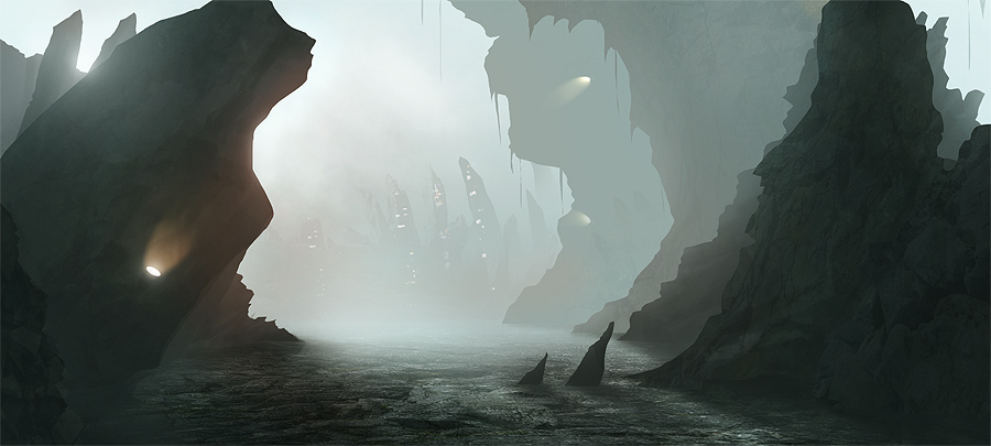
Let’s talk about composition (and speed for a change) in this digital painting tutorial; Mountain City Concept…
Here’s the final image (click for larger):
I’d definitely noticed, and fully absorbed, the fact that my big concepts were taking too long. Sure, one of them (taking around 7 solid days) won a Daily Deviation, made it into the 3dtotal.com gallery as well as their tutorials and was asked to be submitted into this year’s Digital Art Masters (although didn’t make it into the final selection, ah well).
But I can’t just tell potential clients “Yes, I can do you that illustration, it’ll cost you a week’s pay and take 5-7 days.”
So I began doing speed concepts. Here’s a few practise pieces:
The above three images took between 2 and 4 hours each. Now, this isn’t really ‘speed’ as it should take around 1-2 hours but I’m working on that and at this stage in my development I shouldn’t be as worried about speed as learning (as long as I’m not taking 7 days that is!).
Composition comes first!
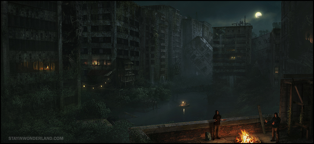
Learned this the hard way. Here’s an image I made without pushing composition hard in the beginning:
Now it’s quite well rendered and took a good 5-7 days as per my usual highly rendered stuff but I found myself, at the end, trying to render, detail and levels/col balance/saturation myself in circles! This was because I didn’t really hammer composition very very early on.
My first attempt at trying to practise decent composition also failed because I was starting with a photo, trying to lay down colour, basically do a quick matte painting. I then looked at some more pro-level speed concepts and saw that many were monochrome. So I stripped it right back to black and white speed concepts. The three images above are the result of that method, as is the image I’m focusing on in this post.
Composition comes first. Everything else can wait!
Quick composition with perspective and architecture
Now, previously I had done my quick concepts for very smoky landscapes. I did wonder how one can be quick and messy… with buildings!? They’re so geometric and straight. Well, I sort of answered my own question with this very piece.
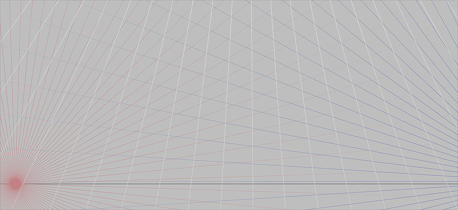
I started out with a nice perspective grid:
If you want a nice composition, 3 point perspective can help out. It’s worth noting in the above that the top vanishing point is a little close to the horizon (despite it being way off the page). This will cause a bit too much weird distortion as it’s quite a steep angle. So if I were to do this again I’d make it slightly less dramatic.
After some scribbling, using the perspective as a guide (and no prior idea as to the subject matter other than – rocks, building/s) I got this…
So, messy – check, nice composition – check (more or less), and… buildings – check! So you see, you can throw down buildings with scribbles.
Of course we’ll have to tighten them. So I decided to start drawing in my details using good old fashioned lines:
(Note: the above is about the 2 hour mark)
Once I had the lines it was just time to paint behind them and get that tricky lighting to play out on all the forms. So a reasonably straightforward process.
Here’s an animated gif of the whole process, start to finish:
(total process time approx. 1 day – ideally this should take around 2-3 hours)
Hope you got something out of this ‘making of’. So get quick and messy and study amazing composition.
One last tip on that note. Before embarking on this new way of painting, I went through my entire repository of saved ‘cool images’ (which are HEAVILY categorized by the way) and picked out 100 images with the best composition (from a collection of about 3000) and with each image that I paused on I would ask myself why its composition worked or why it didn’t quite make the final list.
By the time I’d done that I already felt like I’d progressed in my understanding of good composition.
Oh and perhaps the most important thing one can take away from all this is it began with a big failure. I had poured my heart and soul into that apocalypse painting and it followed on from my success with the Victorian Painting which had won me a ton of exposure. But the apocalypse one got a very poor response. This was quite painful, given all the time I had sacrificed into it, so I vowed to not make the same mistake again.
This time, unless the thumbnail (quick composition) looks very promising and has amazing composition, I won’t be rendering it up over the course of a few days or a week!


Really honest and cool of you to share such honest critique of your own work. I think many of us out there can learn from this kick ass article.
I’m going to step away and do some more work on my composition now….
Thanks heaps for the detailed explanations sir!
Most kind of you to say 🙂