Want to make a cool 3d post-apocalyptic ruined city? Here are the steps I took to create this futuristic image.
 It’s been a long time in the making so I thought I’d commemorate the completion of my post-apocalyptic ruined city concept by documenting how I made it and what I learned in the process.
The format of this tutorial will be in the form of animated gifs showing my steps as well as tips and principles. While there may be a few technical bits and bobs, the tutorial is more advisory so as to allow you to follow it regardless of the software you use.
Step 1 – Research and Reference!
Boy this step is important. I spent a long time looking at photos of buildings, ruined cities such as Chernobyl, digital paintings of ruined cities, matte paintings and so on.
I had several folders for various aspects of the piece. For example I had a folder for composition ideas where I studied good photography that had little to do with ruined cities, although it was primarily urban/city subject matter. I also had a folder where I studied freeways, fly-overs, over-passes and the variously termed elevated roads that cut through cities.
My main inspiration was a short animated film called Ruin. Check that out on Vimeo, it is genius.
I’d always wanted to make a post-apocalyptic futuristic scene and decided to jump in with both feet and not pull any punches. I knew it would be a long road ahead but sometimes you just have to say to hell with deadlines and just make something you really like.
Step 2 – Making of the Buildings
The principles in my previous tutorial on the Victorian Buildings served as a basis for making these too. Check that out here.
Basically you get a really high res image of a building face, slap it on a plane (in 3ds max in my case) and use the ‘Swiftloop’ tool (located in graphite modelling tools) to cut edges into the plane until you can either extrude your window ‘in’ (or external wall features ‘out’) or delete them so you can then replace them with real 3d glass/window frames. Here are the steps in more detail:
- Download a building texture from cgtextures.com
- Bring it into Photoshop and tweak it to how you want it (dirty as hell in my case)
- Go into 3dsmax (etc) and make a plane
- Turn it into an editable poly
- Now add an edit mesh modifier* (explain why in a sec)
- Then add your UVW modifier and make sure the bitmap is correctly proportioned
- Now go back into the edit poly and start cutting away with the ‘show end result’ clicked/checked
* You put an edit mesh modifier between the poly and the UVW modifiers because otherwise, as you push and pull edges around, you’ll see it stretch and mess up in your 3d display. Just a random 3dsmax glitch/nuance.
I then deleted all the windows and added a shell modifier (to thicken) and then used the symmetry modifier to create duplicate 4 walls (you have to rotate the symmetry gizmo to get it to work, it’s also weird and needs a few tries to get right). Here are my steps…

I’ll go over foliage in a minute. For now you’ll see the basic construction, removal of the windows and tweaking of the texture to look more dirty/green.
Here’s the second building using the same steps…
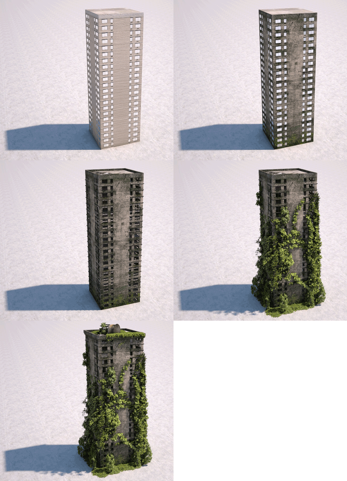 This one looked too straight so I decided to add some roofing detail.
At this stage I was creating mid-ground detail buildings. They weren’t supposed to hold up to close-up scrutiny. That said, I learned an important lesson here. Don’t assume that because you won’t be seeing stuff close-up in 3d that you can sacrifice detail. It kind of does show up in subtle ways in your final render, even if far away.
Tip: do a big close up render every now and then. Check out how your detail looks. It doesn’t have to look amazing up-close but it should look pretty decent.
This next building was designed to be seen somewhat up-close. So I spend a lot more time making this (about three times as long as the other buildings)…
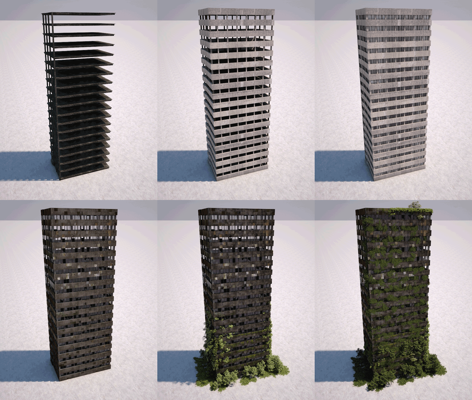
I made every piece separately here in case I wanted to destroy the building later. I also learned by this stage that the ivy I was using in the previous buildings just wasn’t providing enough detail and also the ivy scale wasn’t suited for such a large building. It would have cost millions of polygons and a ton of real-time processing/memory power. Where did I leave my octa-core processor and hundred gigs of ram? hmmm.
Which leads me to my next step…
Step 3 – Foliage, Plants and All That Green Stuff
So for the foliage I used a combination of Ivy Generator (free and standalone!) and itoosoft’s Forest Pack Lite (also free plugin). I don’t have a budget for creating movie-quiality foliage and so I decided to use these guys. Forest Pack Lite is very good considering it’s free.
I started out using the Ivy for my main creeping vines and instead of using the default ivy bitmaps and opacity maps that are auto-generated with Ivy Generator, I made my own from other 2D foliage maps I had it so that each leaf geometry would contain bunches of leaves rather than one leaf. Pretty good in principle but as you can see from the above chunky foliage, it just looked too big and not fine enough. Also, the Ivy Generator makes very expensive poly counts for its exported geometry. We’re talking about 250k for a reasonably detailed small patch. Great for a small scene, but I’m building part of a city here!
My solution was to use Forest Pack Lite, make a forest spline, turn the spline 90 degrees so instead of the foliage being perpendicular to the ground it was instead perpendicular to the building faces and add bushes rather than trees (the free high quality one that comes with FPL). I then went into the transform dialogue and made the bushes very flat and very wide. Finally I would pull the whole selection back into the face of a building so it looked like the foliage was growing out from inside.
I also had a few tree forest splines in the normal upright position whereby the trees were tilted slightly and then placed those splines inside a building. This gave the impression that trees were growing out of the windows at a slight angle. I might then use a few layers of these stacked on a few floors to imply trees growing on multiple levels. Then there’d be the odd single instance of a FPL tree sprouting out from a lone window higher up.
Step 4 – Render Tests
Now, up until this point I still had no concrete idea of what the final image would look like. All I knew was that I wanted it to be landscape and feature a road (as mentioned in the research) going through the middle. I wanted it to be hot, humid and sunny also.
So at this stage I wanted to know how things would look ‘in situ’ to see if I was on the right track. Here are the test renders I made at this stage…
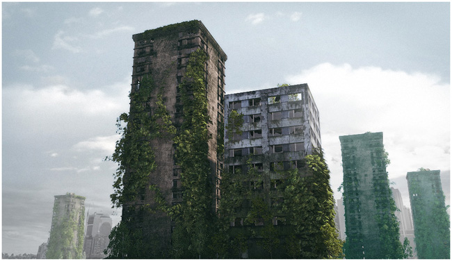 Wireframe (click for larger)…
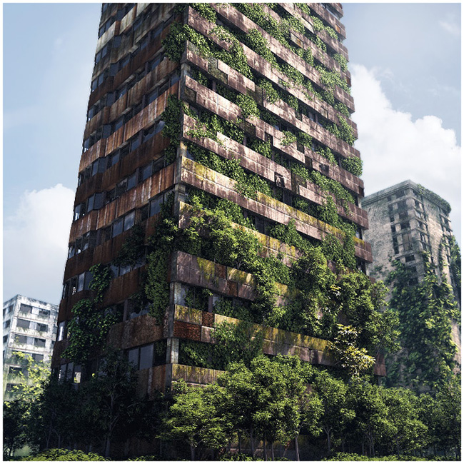
I was quite happy with these tests. I started exporting alpha and z-depth so I could place a photo background and create some DOF and fog. Another thing I learned here was that my previous tests didn’t have a hot enough light source, so I increased the exposure.
Step 5 – Composing the Final Image
I first began by trying out the landscape approach but I found it didn’t allow one to fully appreciate the full length/height of the buildings. Here’s an early test…
 I returned to my reference and found that a lot of decent urban photography was portrait so I changed course and went down that route. Here are the steps from this point until the final composition…

At some stage I knew that I wanted some ground mist/fog/cloud. So I set about doing that. It was a struggle but I used Vray Environment Fog. Here are a few things I learned about that:
- Make your fog red or some such while you’re trying to see how it’s forming. If it’s default white then it’s hard to tell where it is.
- Put it in a box (gizmo) rather than scene-wide.
- Zoom out so you can see the whole gizmo and do your test renders that way. It’s helpful to get a full shot of what’s going on.
- Use a fractal noise for the fog density and make sure you see distinguished areas of solid black and strong white in the material preview rather than a grey haze.
- Play a lot with scale. It may need to be tiny, it may need to be large.
- Play a lot with fog distance, it may need to be a very low setting or very far. For general even-fog in such a scene as this I’d use a distance of about 1000m but I didn’t start to see clumps in this scene until I had it around 3-5m!
- Don’t just follow someone else’s tutorial settings. Scale is key and yours and theirs may differ a lot. So play about.
If you look at the above animated gif you’ll see the lighting is the same direction throughout and then on the last frame it changes. This is the lighting I went with. I noticed that the sun was more or less the same direction as the camera/viewing angle. This flattens the buildings.
It’s good when rendering architecture to have one face of a building in light and another in shade, so I moved the sun around until I got what I wanted. It also picked out and highlighted the foliage better.
Another interesting point is the road. Notice at first how it bends around. I tried it totally straight and realised that it pulls you straight through the middle of the picture, so went with that.
I also noticed that the angle of the buildings were all pointing into the middle of the picture, giving a strong focal point and not leaving the eye to vaguely wander around the image, getting lost.
Step 6 – Post Production
There was a fair bit of work to be done in Photoshop. For each of the above stages I also did a complete mock-up to see how it would look, roughly, after post production. So I didn’t just start with Photoshop at the end, it was an ongoing process of checking.
Here’s a comparison of the raw render vs the final image (click for larger image)…
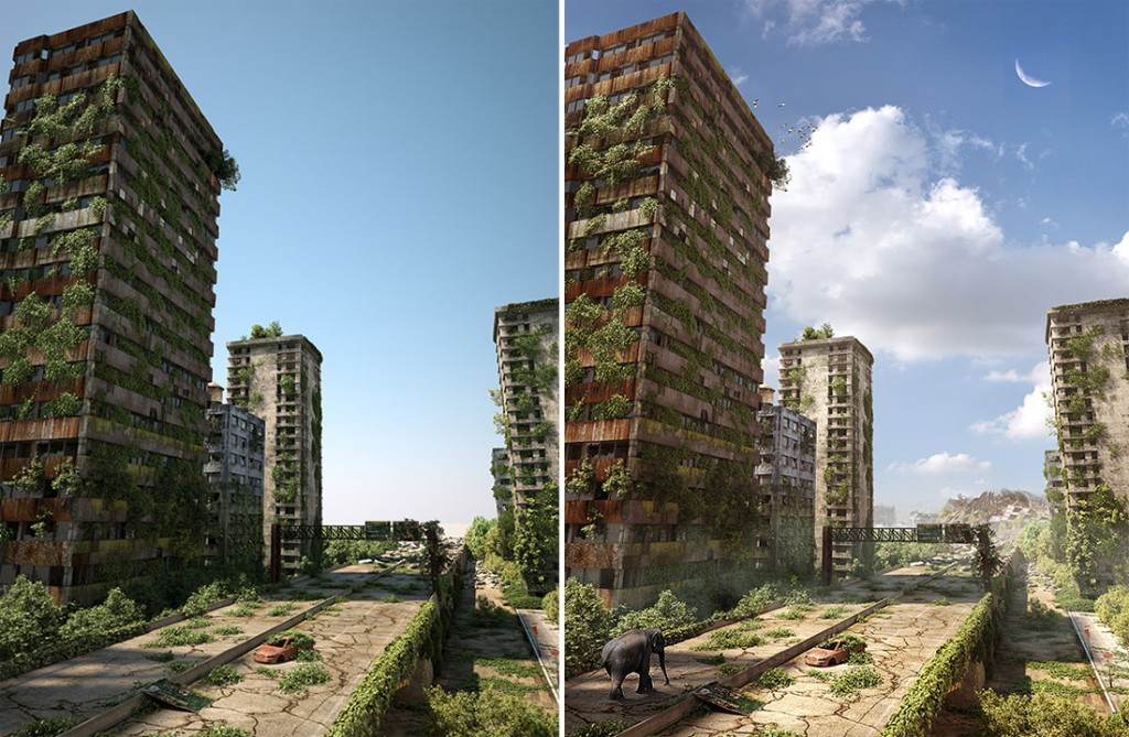
As you can see it’s quite different once fully treated in Photoshop. The raw render should always be considered a starting point.
I went to work matte painting various elements in and applying a warm colour balance.
The render was 3000px high and took about 8 hours. I added Vray Atmosphere to the render elements which allowed me to adjust the ground fog. I had to also render a scene with no ground fog at all so I could start from a blank scene and build it up. Subtlety is your best friend in post/matte painting.
One thing I had to abandon was the idea of a bunch of wildlife in the mid-ground. Any animals like large birds or deer were just so small you couldn’t tell what they were. At this stage it’s a real challenge to know when to stop and the tweaking can go on forever.
So, I hope you enjoyed the tutorial. Please feel free to ask questions either via an email or in the comments (so others can see the response).
Stay tuned for more of the same!


thank you .. mr.wonderland
this workflow overview really helped me alot …
i will come here more often to learn from a
true master in progress …
love the retro future posts and
thanks for the brushes 😉
Most welcome, thanks for the kind words 🙂
Very inspiring post! I wish I could get a similar result, though I know it needs many years of experience. I have lots of concepts of these kind of art in my mind, but what always stops me is the stage when I need to render it, it always ends up looking very plain like a usual architectural scene. So my question is, what is the key to get this matte-painted feel? I’d appreciate so much if you give some details about your Vray render settings for this scene, or the general output from 3ds Max, and also what kind of layers/passes you took into Photoshop to make the composition. I would be really great if for your next tutorial you can reveal us beginners the Photoshop part to get such an amazing final scene 😉
Thanks for the inspiration!! Now I’ll go and try one more time…
Hi there, thanks for the interest.
Well, lately I’ve been doing more paint-over in photoshop so when you say that the render comes out like an arch-viz render – that’s fine in a way because layering over textures in photoshop will make things look much less digital, much more photographic. Then 3ds max becomes just a bare starting point.
But for this particular image, you’ll notice that the raw render isn’t that different from the photoshop work. (there’s a comparison above).
Key points are, however: photo sky and photo far ground, for added realism. And there’s fog too which is crucial to understand. Everything needs lots of atmosphere (and even MORE if we’re wanting to pitch for games and movies as they want fantasy environments + photo real if that makes sense, so fantastic levels of fog/mood).
Finally, study photos so you can understand how to expose. Sometimes there are spots that should be too bright but your render might be all mid values. In the before/after above you can (in the raw) see way too much black, not enough atmos and the whole thing needs to feel hotter. So brighter sun, lighter shadows and warmer colours. All that comes from looking at photos and looking at other people’s art and going (for example) “oh, it really is bright there isn’t it.”
Good luck. Feel free to send me a piece and I can offer some crit.
Hi, thanks for the tips! I will for sure try to send you something as soon as I get some result. I appreciate a lot your willing to help!
Wow I am trying to make a city like this .For a future game basedon the Terminator world .I hope my city will look great and this helped alot.You are a Master of this cool Art! Thanks for the help:)
Thanks! and good luck with your city image 🙂
Hi stayinwo, great buildings! I was wondering, I’m making a post-apocalyptic film and I’m looking for models that I can put in a city, so that it can be seen from several angles. I was wondering, would you like to lend us or maybe sell us some of your buildings so we can add them in the film? We don’t have a large budget, but your name will be in the credits ofcourse. Check out the trailer here:
Let me know!
Hello!
This tutorial is wonderful, really. Yet for me it is still a bit complicated, because i`m just starting getting into all that cool world of 3D art. =)
But this thing is very very inspiring. And that`s very important.
And the scene itself is just fanyastic. I`m not that great fan of post apocalyptic scenarios, but this picture is great. And that elephant… i`m so glad, you did not make mainstream deers and birds or bears. Elephant is such an awesome decision!
Hey, thanks for the comments. Yeah, best wait until you’re a bit further down the line before tackling a tutorial like this. I’ve been doing this for many years and have many more to go.
Good day. I would like to ask how much time you took this scene. I would sometimes create something similar.
About a week. Anything done in 3d takes a long time, especially when vegetation comes into it!
I liked this post .
But what you should put in or make 1 tutorial is about how to use the phtohoshop for textures , as no such things appear in google .
Thank you as well.
Hey Siw, I know this is an old post, but I was curious and wondered if I could use one of your photos as a reference for a mock level design document I’m putting together for one of my grad school classes. I’ll be absolutely sure to credit you in the work, but I figured it would be easy to ask first.
OP
sure thing 🙂
Saw this post on linked in and wondered where they got the image from. https://www.linkedin.com/pulse/why-banks-have-chance-survive-axel-schultze?trk=v-feed&lipi=urn%3Ali%3Apage%3Ad_flagship3_feed%3BNZSqYg5v8ySxR1whFnJF7g%3D%3D
thanks for the heads up!