


Happy Halloween everybody! Let’s walk through my spooky painting and also talk about the importance of thumbnails…

Here’s the final image:

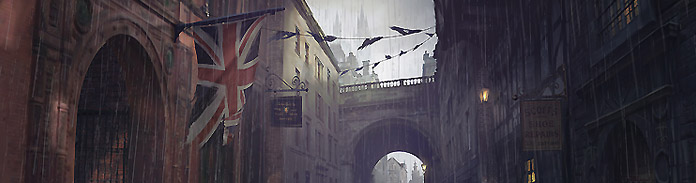
So, I had some time between client work and I thought I’d cram in some portfolio work. The above image didn’t turn out as I had originally intended – my initial idea was to create a Tudor street that was heavy on the spook and name it ‘Halloween City’.
I began making thumbnail after thumbnail until I got bored of trying to nail a street scene and decided to wander into other territories. So before I go on, let’s talk about something highly important to the artist… thumbs!
Many many thumbnails
I actually spent days on thumbnails, just because I knew that I needed the practise. Here are a few that I came up with…


I really liked the idea of the tree with the face and light shining out of it. Kind of like a carved pumpkin/tree hybrid. I tried to frame the tree (second to last image above) using leaning/fallen trees and it just crowded the composition, so I tried a new approach and came up with the composition just below it, giving the main focus some breathing space and framing it with a foreground tree and some foliage (bottom right of the comp).
Here I learned the important role of value/atmos perspective in creating composition. Without defining solid levels of distance/value in the final thumbnail, we won’t be able to focus on our tree. As an example, we’ll need to create a significant difference between the foreground tree the the main tree, as well as the background trees and the main tree. The foreground tree will need to be very dark so we don’t pay much attention to it and it acts as a block for the eye so it sort of ‘bounces’ off the left and into the main tree. I say bounces, it’s more like the eye will disregard it.
I never used to do thumbnails but the thing is, you can really get a decent composition this way, and composition is EVERYTHING. So do as many as it takes, even if it takes forever.
The main Halloween painting
I began by up-scaling my thumbnail to 7000px wide. This is the largest digital painting I’ve done at this point. I used to paint around 4000px, maybe 5k, and even this 7k pic is a little small. I would ideally like to go 10k but Photoshop and my laptop start to hate me, and I them! So lesson two – get a fast computer!
Oh, before all that, we mustn’t forget the second most important rule after composition – research and reference! Reference of two kinds actually. First, I gathered pictures of pumpkins but also, and this is a big tip I think, I gathered pictures of awesome digital paintings that I aspire to make, ideally in the theme of my chosen painting idea. This is how you get better. Look at an awesome painting and ask yourself how far you are from that level of polish.
Ok, animated gif time. Here’s a step-by-step animation of my process. As usual there isn’t much to say here in terms of blow-by-blow so I’ll instead share some philosophies at the end…

One issue that prevailed throughout was when to call the level-of-detail ‘done’. For this, again, I recommend looking at another painting and ask yourself if your detail is as good (for want of a better word) as that painting. It’s not just about high levels of detail, but more efficient levels of detail. Great painters can get enough light info in a few strokes. It depends on what you want your style to be along the spectrum of tight versus loose.
I feel that as I progress, the level of finish on this piece will seem like an intermediate stage rather than a finished stage. However, I also would like to be able to achieve a similar quality with a lot fewer brush strokes.
All the while I was painting this, I had other art work on my spare monitor. If I needed to make a half decent tree, I would see how a nicely rendered tree looks and not stop noodling until I felt it was good enough.
The whole painting was a learning curve for me as I’d never really painted trees before. Not spent much time on grass and also hadn’t really done much in the way of stylised, cartoonish art either. Plus I nearly ALWAYS use photo textures and it was tempting to do this, I even dragged a few on just to see, but I resisted. So the only photos actually are the background sky, which isn’t even visible, it just laid down a basic gradient/tone to build on. This is kind of a first for me in terms of environment painting using only brush strokes!
And in conclusion…
Again, composition is everything. It’s also subtle because you can’t, for sure, say whether it’s definitely ‘perfect’ or not. You can’t say for 100% certainty whether the eye is going where you want it to. One of the best ways to check this is to a) briefly take the colour out and check that the values read well, and b) shrink the painting right down to thumbnail size and see if it looks awesome then.
For me I’m not 100% sure I nailed the composition, I think a lower viewing angle with more forced perspective would make it much better . But that’s part of being an artist, you have to keep moving on and then one day you’ll look back on each piece and realise that it kinda sucked and you’ve improved loads since. Well, that’s the plan anyway! Until then, keep thumbnailing, keep staring at great art work, and admit that you suck until you can do as good as your favourite artists! Not necessarily fair but hell, it keeps the blade sharp and keen!
After thought:
As soon as I’d published this piece on the various web galleries I immediately realised that I didn’t like it. Which is so odd because I was very excited as I was painting it, thinking that it could be my strongest work to date. When it was uploaded and sitting in a gallery I took a second look and really didn’t like the composition. So I thought I’d share these thoughts because it’s not ideal to provide a how-to when you’re not actually happy with what that how-to produces!
First off, the composition is a little weak. We have two trees that are competing to some degree, even though one is positioned better and lit up, we’re still competing.
Secondly and more importantly perhaps, the viewing angle is entirely uninteresting. It’s just looking straight at the focal point at eye-to-eye level. And this brings me to my next point (the two are interconnected)…
Thirdly, there is no sense of depth or perspective. So if we were to look up at the tree from a lower angle, that would create a much more interesting viewing angle, and if objects were coming gradually into view, all the way through far ground, mid ground, foreground, extreme foreground, right up into our face, then we’d have depth.
Finally, I think the colour composition is too dual tone. We just have orange, then everything else is blue. I think the colours need to be less stark than that.
So the take-away is, if I had applied the above, the piece would be a winner and would have improved dramatically. As it stands it’s kinda mediocre.
Hope this little footnote helps. Gotta keep improving!
Great post. Your thumbnails are a little too finished for my tastes haha unless you’re REALLY fast. I appreciate your after thoughts about why you don’t like the image. I don’t think it’d take too much time to refine your painting and really kick ass. Aside from the compositional problems you pointed out, I think this is a great illustration. Good job. You make it seem so effortless.
Thanks for the comments 🙂 you’re right, my thumbs did take about an hour each but I’m still getting to grips with that side of things.
I agree…GREAT post! And by the way, I LOVED the thumbnails. I like how you exaggerated just about every composition. You’re a talented dude. Keep up the great work.
thanks Peter 🙂