This is as much of a journey through digital painting as it is a making-of. Join me in an exploration of skill-development…
Introduction
This image took a very long time to create, but I took this time on purpose once I realised what I was undertaking. Ironically, it began its life as a speed-painting…
I had intended to photo-bash some trees together and make a forest kinda piece with someone on horseback riding through. Wanted to prove to myself that I could whip something up in a day or two. So I gathered a ton of reference and started at it. The above was done in colour but I was trying to sort out composition and so added a black and white filter.
First Hurdle (composition)
At this stage I was unsure as to what direction to take so I watched a Gumroad tutorial be Eytan Zana on graphic composition. It showed how he used around three values to make a decent thumbnail and went from there. Here’s the thumbnail/comp I ended up with:
So at this stage I figured I could just start placing in photos of trees etc. and so I arrived somewhere around here:
Second Hurdle (grass)
But at this stage I felt blocked. I had no idea how to paint grass and I was struggling with the ground plane. So I took a few days off to do some studies of dappled light on grass. Here’s a couple of studies I did…
 I was also struggling with leaves and foliage so I also did this one:
Ok, time to go back to the painting!
Third Hurdle (trees)
So I was better with getting the ground vegetation down, at least in terms of values/colour. But then I started working on that tree on the right and I just hated it. Sigh. Ok then, off to study some trees.
Now for this part I actually did some sketches (I won’t show those because they were pretty crap and really just served a purpose of understanding the form of a tree). I mainly wanted to get the shapes down. I also did a ton of reference gathering of trees and separated them out between shape versus lighting because some photos look great in terms of shape but are very flat and some show excellent light. I put all this together and went back to work on the tree…
Fourth Hurdle (leafy branches)
I was then struggling a lot with bunches of leaves. Jeez, it’s never easy! So I started to study how other artists had painted this. Here are a few examples…
And how I implemented that:
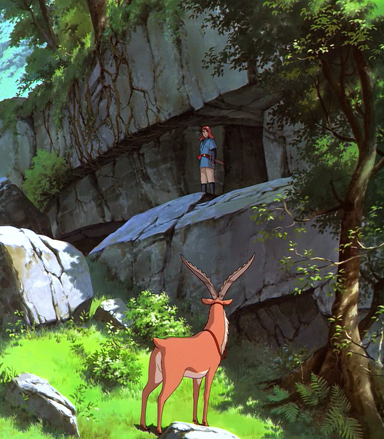
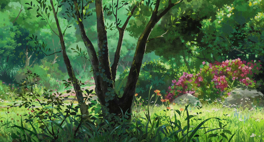
Now this next part wasn’t quite a hurdle but I needed to tidy up that grass. So I gathered some reference from Disney (from my extensive collection of Disney background art). Here’s a few…
And so I gathered that what you seem to do with grass is to paint in its 3d shape using, in my case, a soft round brush (man, I never use the soft round brush) and so I got some basic form here:
Then I used more of a leaning grass-blade scatter brush for this (rather than the vertical, spiky brush from before… in fact I think they’re the same brush but this time I angled it having been inspired by the above Disney stuff):
I placed a dodge layer above the basic soft-round grass layer to paint in the light pools and then made new grass layers above that. The bottom of the blades were smudged in so they didn’t look like they were floating and instead blended with the underlying soft-grass layer.
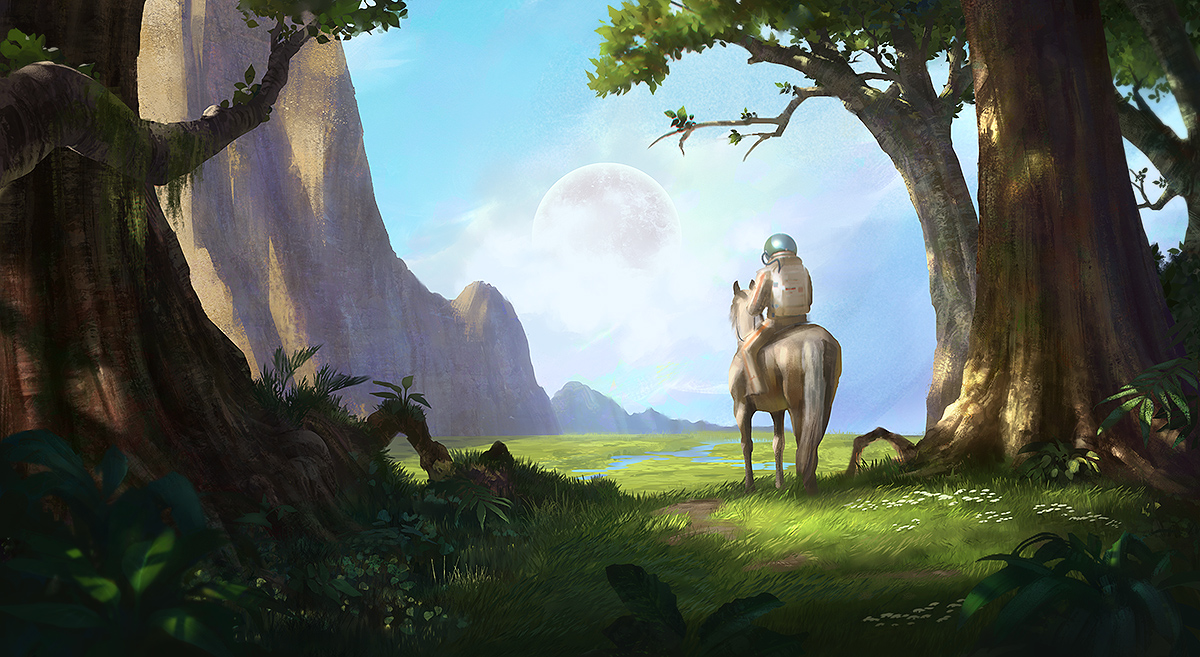
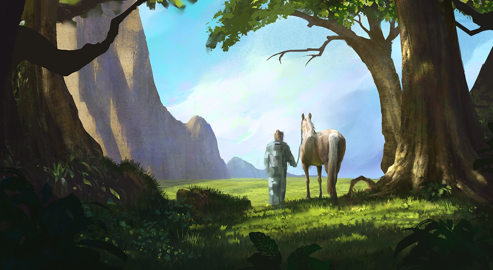
Then came the horse, the space dude and the orb. With the horse I just copied the above like-for-like (it was originally a photo that I used a filter on to reduce the detail but I wanted the whole painting to be free from photographs, just as an exercise really).
So here’s the horse and the dude:
The guy was partly from imagination and partly using some photo reference. I wanted him to have a retro sci-fi feel to him as I love that style/genre.
And then just the finishing touches and the orb:
Bonus Treat – Animated gif in about 60 steps!
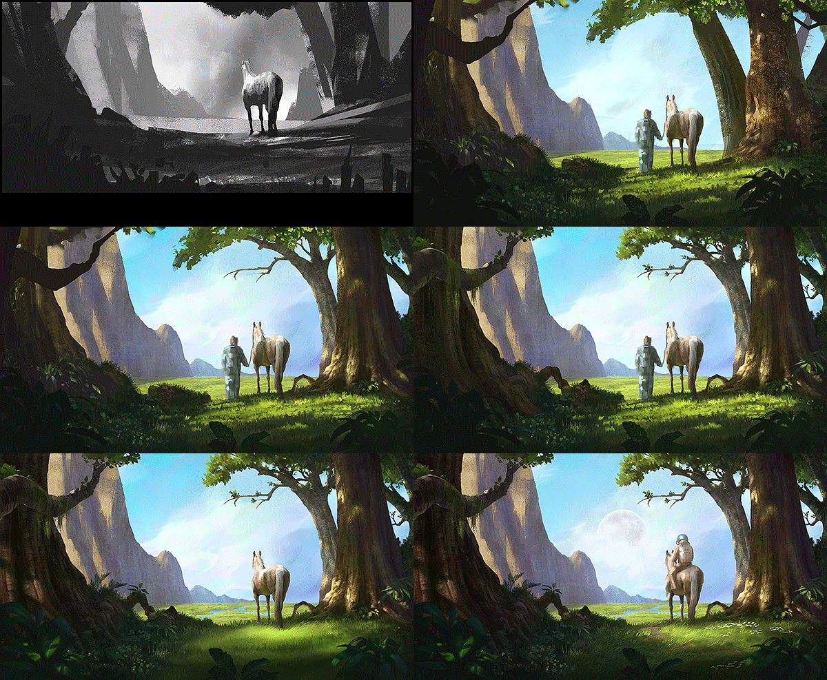
It’s worth mentioning that at a very early stage, around the first grass hurdle, I stopped previewing my piece at 1000px and started previewing it at 600px.
What do I mean by this? Well, something that’s unique to me is that I periodically save off a shrunken down, flattened and sharpened version of my paintings so I can see what their true definition/sharpness is. I usually reduce to around 1000px but because I wanted to really focus on the thumbnail aspect of this (and by that I mean composition), I reduced it so it was fairly tiny and I could then take it all in as a whole and not get distracted by peripheral aspects.
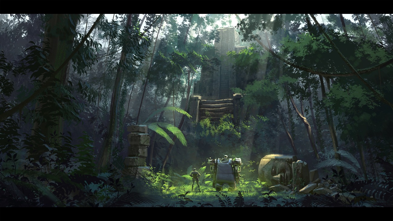
Even then I might step back from the PC to see how well it works as a thumbnail. This time I really prioritised composition and wanted something that was very strong. So you’ll see everything in the piece makes us focus in to our characters and their view beyond. The whole composition shape is a circle really, or spiral.
Conclusion
Production art this is not. This took around three weeks. Not necessarily solid, but semi full-time. However, the reason I made a painting in three weeks that would take a pro an afternoon was because I really hadn’t nailed grass, hadn’t nailed trees, leaves and I guess landscapes in general.
As an aspiring environment concept artist I had to really go deep so I intimately knew the foliage. It half killed me but it’s the best full-digital-paint piece I’ve done and probably the best piece I’ve done in terms of composition.
So… next time it’ll be a lot faster. Eventually it will be second nature. Until then folks, hope you got something out of this! If so, please comment and let me know your experiences or shoot me an email 🙂






Love your making of’s they are great thanks 🙂
Most welcome!