


Digital sci fi art tutorial in Photoshop: Rock Formations.

This digital painting took around 4 hours in photoshop using some pretty standard brushes on the whole. Read on to see how I made it.
 Still in keeping with my love of 70s sci fi, today’s digital painting tutorial brings us more of the same. This time I started with the intention of studying some rocks when I came across this reference Image (left). This image swayed me into making something with a sci fi edge.
It’s somewhat reminiscent of that kind of Planet of the Apes geology. That movie for me is quite the epitome of the 70s dystopia genre and I love the mood and colours.
Also, there’s a kind of alien mystique about this kind of terrain. When Heston first landed on that mysterious planet, it really did look a bit extra terrestrial. A little bit like a strange 70s sci fi novel cover.
Let’s get onto step one…
Step One: Rough Composition

I went for a better aspect ratio on this digital painting vs the previous one. With that, this rock series had strong potential for a nice composition. Colour too actually. The sky in the desert is vivid and solid. Evocative. So I threw down some sky and some rough rock, indicating light source.
Step Two: Detailing the rocks

I didn’t know which way each rock would go or turn out. I threw down some more light and wherever there was light hitting, obviously some degree of shade would follow. Smudge tool came in handy again here.
Step Three: Further detail

You’ll notice the shade coming together here. I realised that I’d been keeping too small of a scale on the nearest rock at this stage. When I got stuck into the middle one my brush strokes were larger and it formed more of a solid piece of rock. The first one is a little too smoothed I feel. But then I also fancied that each rock perhaps should be quite different to add an air of mystery – rock formations should be somewhat similar in nature, so this lends a little bit of strangeness.
So yeah, just bringing up the highlights and taking down the shadows.
Step Four: Texture and contrast

The rocks needed a bit of grain and I also wanted to have the overall picture look less clean. Because I was going for the 70s vintage look, I wanted to maybe have the image itself resemble something that was a few decades old.
I added some worn paper overlay with the intention of having it just be a subtle layer transfer but when I tried ‘colour burn’, it really made the colours jump out, turning the yellow-browns into burning golden oranges. Nice.
Step Five: finishing touches
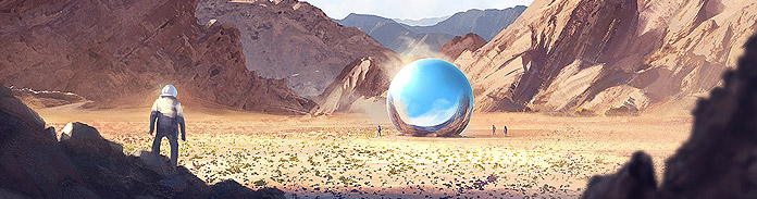
I added even more contrast (via an adjustment layer) and put a little astronaut in there. I also added a couple of moons to ensure the viewer didn’t think this place was earth. Or at least earth as we know it.
So, if you want to see a bigger (and more crisp) version of this then go to the portfolio section and look for the digital art subsection.
And if you wanted to buy this as a print then visit my deviant art.
Thanks for reading and please comment if you got something from it!