


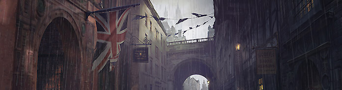


Time for another Victorian-inspired street scene using 3d and Photoshop. This time I push the realism a little further…

Ok, so here’s the final image:

This piece went on a seemingly long journey and underwent many many iterations and changes to get to this final stage. If any young artists are looking at this and thinking that it’s cool and wondering how one even goes about starting such a piece, don’t worry! I could not have foreseen the finished product from the start.
Let’s talk about speed and turnaround
This concept actually started out as a Victorian Sweet Shop piece with the tavern being the sweet shop. So that’s one seed, the other seed was that I was inspired by this youtube video where Peter Mohrbacher is interviewed and he talks about spending THREE YEARS on an art piece because he just wasn’t satisfied with it. Ok, it wasn’t a solid three years but the point is, rather than just call it done, keep at it until it’s done. Don’t just put out something that isn’t your best and you know it isn’t your best.
Now, as far as the ultimate question, “how long did that take?” and variations thereof e.g. “how long should it take?”, I myself have struggled with this. I often felt panicked into rushing something because, were I in a studio, the whip would be cracking! But… the thing is, you can try to get better, but you can’t try to get faster. Speed comes as a consequence of doing the same things over time.
So what’s interesting is that I sat down, freshly inspired by the video linked above, and was prepared to spend a month on this piece. My previous few images had bombed on the forums and I hadn’t put my all into them, so this was it, yo. Time to get down to some serious work. Turns out that, even though I was doing this relaxed and with no pressure to finish it quickly, I still turned it around in about five days. And one of those days was spent studying Vray principles to understand about sampling and subdivision (ugh).
So, sorry if this intro is a little long-winded but that principle of quality vs turnaround is one of the main seeds behind this piece and is necessary in deconstructing how I did it. When you’re not a pro yet, make your work amazing – not quick.
Victorian Architecture Reference
Here’s a screen grab from my reference folder:

I was heavily inspired by those sepia images, which appear to be photos of actual Victorian buildings in the actual Victorian period (or close to it!). You can see a similar style in the shop corner on the bottom row of thumbs when compared to my tavern. Also the veranda/balcony things on the middle row.
Early concepts
It took a while to get the camera angle right. Here are some early aborted attempts:
Now, it’s worth mentioning a little cheat here. I lifted all the buildings (except the main, central one) from two previous projects: my Victorian Street Concept and another Victorian 3d Concept. So I would recommend asking yourself if you’re ever likely to use something again and if the answer is yes, then take the time to model it – it’ll save you time later when you re-use it! For example, the street lamps in this scene were made a while back and I use them in any Victorian scene I do. Save in the long run!
Back to the piece. I wasn’t keen on where this was going. The eye wanted to split down each of the side streets and the main building was getting cut off at the windows no matter what the camera angle was.
 I was pretty convinced I’d found the winner here. But I was having niggles. Again, going back to the core principle: don’t just do it, do it well – I just had to keep pushing until I was happy.
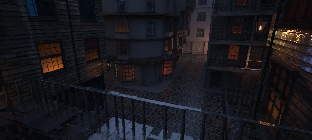
We have a fairly nice composition – all the perspective lines take us to our focal point, but it feels a little far away and removed. It could be that all this piece needed was a ton of foreground elements, maybe. But either way I started messing with the camera angle again to come up with this:

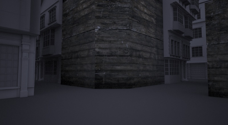
Here’s the final angle. I felt that the buildings were coming towards us and again those lines and angles were taking us through the painting without us getting taken out of the frame.

My other goal with this piece (or at least it became a goal) was to add heavy rain and wet surfaces. So I added reflection to the wood, and, learned a bit about specularity. Let’s talk about lighting a night scene for a minute and we’ll do that by looking at how Peter Jackson’s cinematographer/DOP lit this scene in Fellowship of the Ring:

You’ll notice, if you study cinematic lighting (James Cameron movies are another example, try Terminator 1 & 2) that night shots are always lit by big blue lights that sit just out of shot. I mean, if this were a medieval world I can assure you that no such light would exist like the one shown above.
But notice the wet, specular surfaces on that building and also note the warm oranges just visible over the wall, hitting the right hand side of that building. This is what I had to do with my scene and it was accomplished by adding strong lights near my wall that only served to act as a reflection or specular highlight. They don’t affect anything else in the scene.

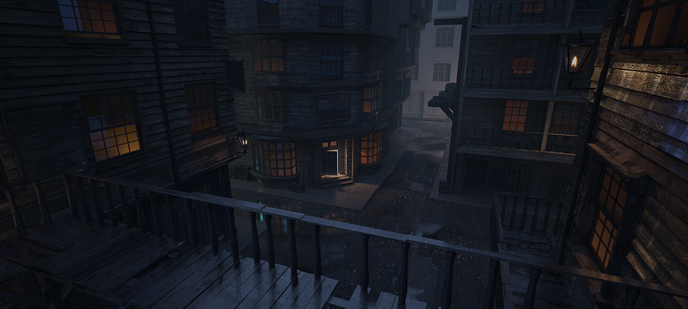
Above I’ve added something that was desperately needed: a foreground element. It’s always important to fit in some kind of foreground to midground to background scheme to take the audience through it. I thought that maybe this scene could use wood liberally and use balconies and verandas throughout. Kind of like a network of railings that would wind around the buildings. Also note that now we’re not floating, we’re almost standing on the balcony. In the above scene I added some rain in Photoshop just to see what it would look like.
NOTE: At this stage I am obviously not finished with the 3d aspect. What I like to do is render something out, low res, then play with it in Photoshop to see if it has legs. This will affect how I model/texture.
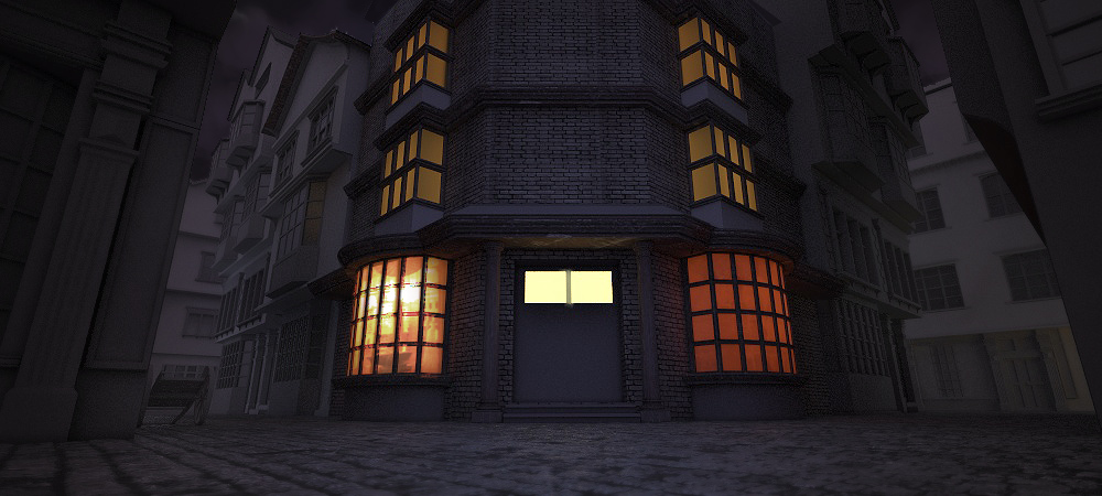
Having been inspired by the wood theme, I got rid of the brick work on the left and replaced with more wood. I also didn’t quite like the windows so started those from scratch. The glowing window is made by placing a box behind the window (a box with one poly deleted – the poly that faces the window glass) so it acts like a mini interior space. I use a Vray two-sided material for the glass so its translucent and then the colour of the material itself is orange. I then place a Vray light plane on the base of the interior box, facing up, so that the light grades from bottom to top, as though lit by a desk lamp that’s just inside the window.

Just adding place-holders for signs and some more wood on the main focal building. Also fixed the windows as the previous windows were just placed on. I had to cut in to the building and sit the new windows just inside.

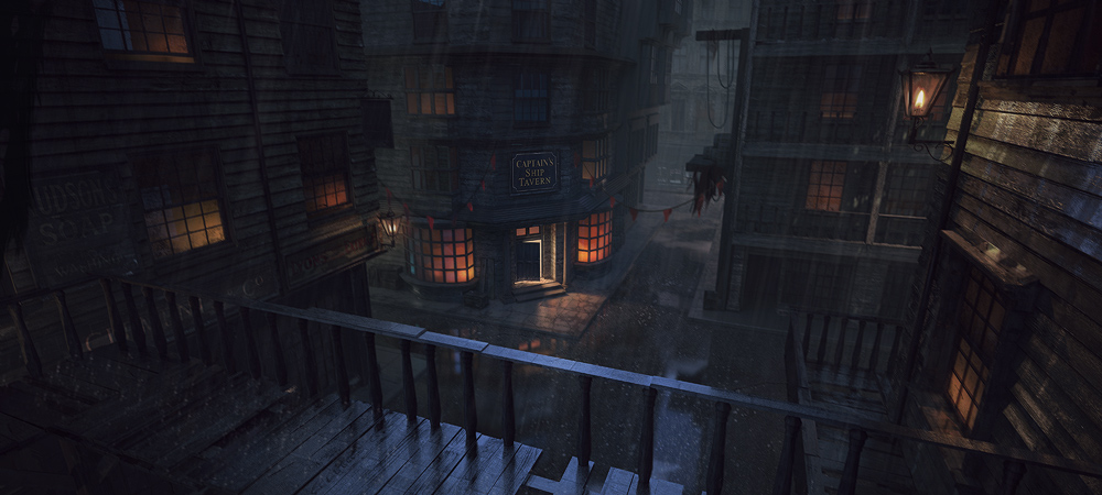
Finishing touches. I always knew that I’d want the audience’s eye to go straight for the doorway. So I created a door, opeend it and shone a bright light from within.
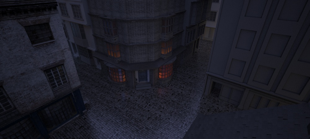
I also got rid of the cobbled floor tile. Few reasons for this; firstly there’s something about a pattern that has a small, heavily repeated tile that just looks too CG and secondly, it’s very hard to pull off a large-scale cobbled floor and the reward wouldn’t have been worth it anyway. So I went with a dirty gravel instead. I actually think this may be somewhat historically accurate in some Victorian towns.
Puddles. I had fun with these. At first I placed a mirrored surface (small plane) just a fraction below the ground and then pushed/pulled vertices around so the ‘water’ came through, thus making a puddle. But it looked WAY too cartoon-ish. So instead I went into the reflection channel of the ground material and created a mix material where there was nothing in slot 1 or 2 (default black, default white) but a very large fractal noise in the mask/mix slot. What that does is say: everything that’s black is matte, but create reflections in these large, white zones. So we end up with large bands of reflective puddles. Cool!
The final stages

Here’s a clay render, just because.
Now I was ready to render out a massive 5000px render, which took about 12-13 hours with all the usual passes such as GI, reflections etc. I did have a mind to build it all up from scratch in Photoshop but the flat, RGB render was actually good enough. The raw render is the same as the image just above the clay render.
Here it is once I’d separated out the major planes (with some fog) and put in some colour-correction and atmosphere:
Significant colour-correction number 2:

The above step is key. I like to get the mud out of those shadows and make them sing. So I put a layer over the top of everything, make it magenta and set it to lighten, then bring down the opacity. Above are some dodges to bring out the lighting. I used my reflection pass as a dodge layer and it really brought out some of those reflections.
 Here I’ve added some vague background buildings (we don’t want to go there with our composition, so it needs to be vague). I also added some beams and some barrels on the mid-right building which gives us a nice silhouette against the background atmosphere.
And that’s about it. Final image once again…
I think the only difference between the two images was a little final tweakage by way of blur and sharpen to pull our focus right into the tavern. Our eye wants to land in the midde of the image and we have these contrasting warms and cools happening there.
So that wraps things up. Hope you enjoyed. Hit me up with any questions and I promise to answer them. And I challenge you to do work that is good and that is DONE and to not fall short or wimp out. Perhaps a key is to set this up in your mind before you start so you’re mentally prepared. Good luck!
I always enjoy reading your posts and this one is no different. Nice mix of humor and serious. My favorite image is the clay render (I just always like those for some reason). The image is awesome but I think the rain could be better on the final image. Currently it kind of reminds me of light rays instead of rain. Keep up the good work. You are an inspiration.
Glad you like it 🙂 and thanks for the crit/feedback. Always useful.
simply amazingg !! how did you add the rain ?